WDEA Works first commenced in 1989 as a service to assist clients with disabilities in entering the workforce. It initially operated out of a small office in Warrnambool but soon extended its coverage. In 2023, the organisation was a significant player in the community services and support sector, with ambitions to do more.
WDEA Works was expanding to serve communities across Australia. As a result, the old initials, representing Western District Employment Access, no longer accurately reflected their ambitions. To to help the organisation expand nationally, the team engaged Fluid to review and consult on how its brand might change to become fit-for-purpose.
Solution
The project began with a deep dive into WDEA Works’ mental and physical availability among audiences. Fluid partnered with the leading market research firm WhereTo to understand perceptions of the brand, its competitors, and the audience category entry points. The project included various quantitative and qualitative studies that helped outline how consumers saw the brand operating within its complex regulatory environment.
An outcome of the research was that the brand architecture would need to shift considerably to efficiently manage the brand in the future as the team sought to diversify its portfolio of services. To tie the various brands together, Fluid proposed a new brand architecture that would – for the first time – create a clear, flexible, and cost-effective approach to brand management, allowing business units to leverage the established brand equity in each portfolio.
Fluid created a new master brand with a new customer value proposition to reposition the organisation. It reshaped how internal directorates were outwardly organised for more efficient and consistent marketing, divided along service offerings. The proposed approach re-focused the organisation on social impact within communities, true to its original vision and purpose.
The new brand was called are-able, proudly declaring that “Together we are adapt-able, cap-able, sustain-able, remark-able. Together we are able.”
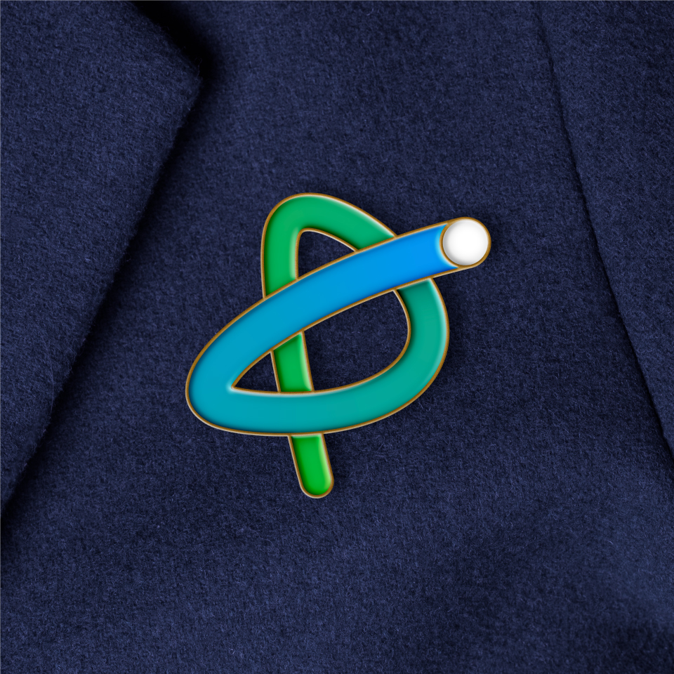
Are-able needed a distinctive look as it would lead a diverse range of services and sub-brands dedicated to helping people nationwide with a profit-for-purpose model.
Fluid co-created the new brand identity alongside the internal team at are-able. Capitalising on the insights from participant interviews, it was clear that everyone who used their services had come along a unique life path. Each client had experienced twists and turns. Everyone’s journey looked different, but when things took an unexpected turn, it was by working together that they were able to adapt, excel, and support each other.
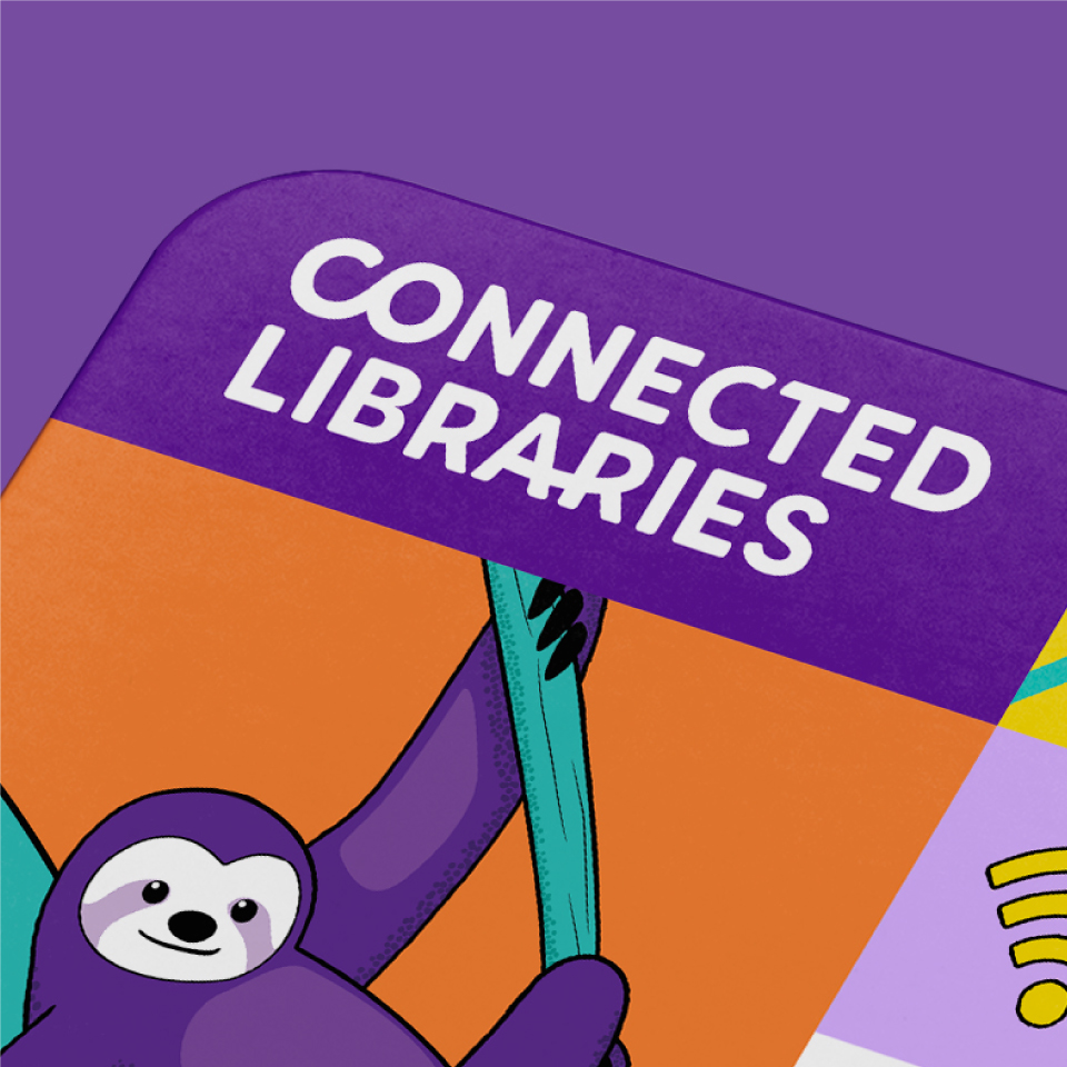
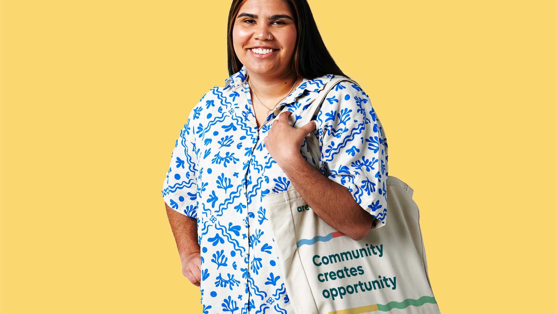
The branding used these journeys and turning points as inspiration, tying together employment services, disability support, training, social support, living, and retail to ‘build communities that thrive’. Brand touchpoints adhered to the latest accessibility standards for print and digital and featured photography that reflected the diverse range of customers the organisation came into contact with daily.
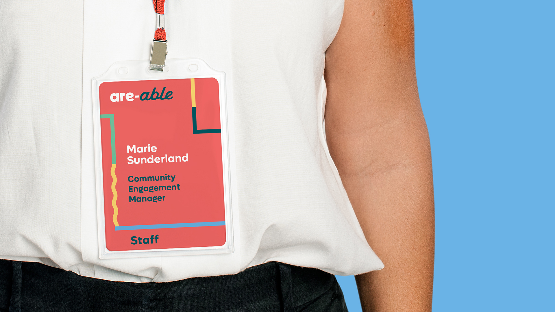
Additionally, Fluid created signage, language, partnerships, corporate communications, and advertising standards to deliver unprecedented consistency and flexibility. Every piece was crafted with the audience’s needs in mind to aid are-able in its purpose to create opportunities for inclusiveness in communities that will see them thrive, doing more for more people in communities and building sustainable businesses that support their local areas through direct investment, local charities, and worthy causes.