
Greenham
Branding The Best In Beef
Launched by Independent Distillers in 1995, Woodstock was a pioneer in the RTD market and has a rich history as a challenger brand. In the early days, the branding was loud and proud, known for its large 440ml cans and sexual innuendo “Crack a Woody”.
– Brand strategy
– Identity
– Brand creation
– Packaging
Woodstock Bourbon is an accessible value proposition in the Ready To Drink (RTD) alcohol category that historically competes primarily on price and some distinctive pack formats. In 2014 Jim Beam changed (6-pack to 4-pack) which led to consumer backlash and loss of market share, so much so, that by 2015 they returned to 6-pack, and heavily discounted which caused price compression in the category.
Woodstock lacked a clear and differentiated brand narrative, primarily standing for value only. Consumer appeal in RTD dark spirits is driven almost entirely by brand perception, so a new strategy repositioning Woodstock was needed to compete with the aggressive category leader. In a mature category segment, Woodstock could no longer rely on the value play and needed to establish relevance beyond price.
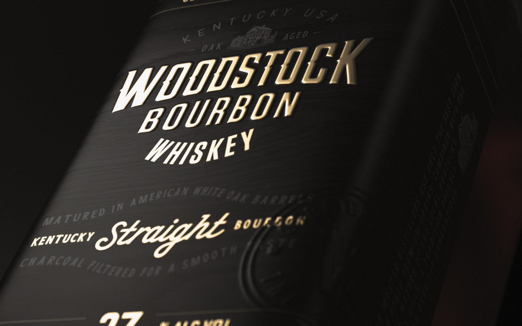
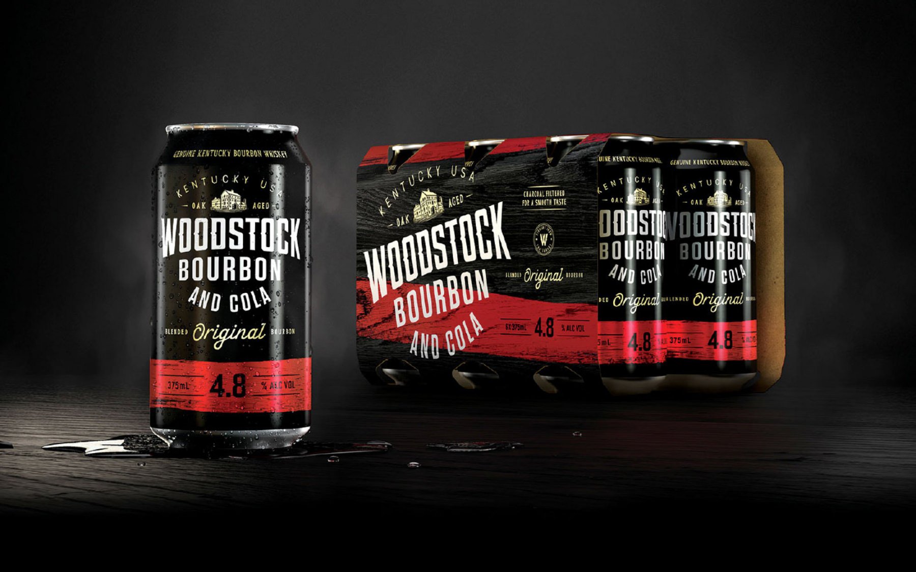

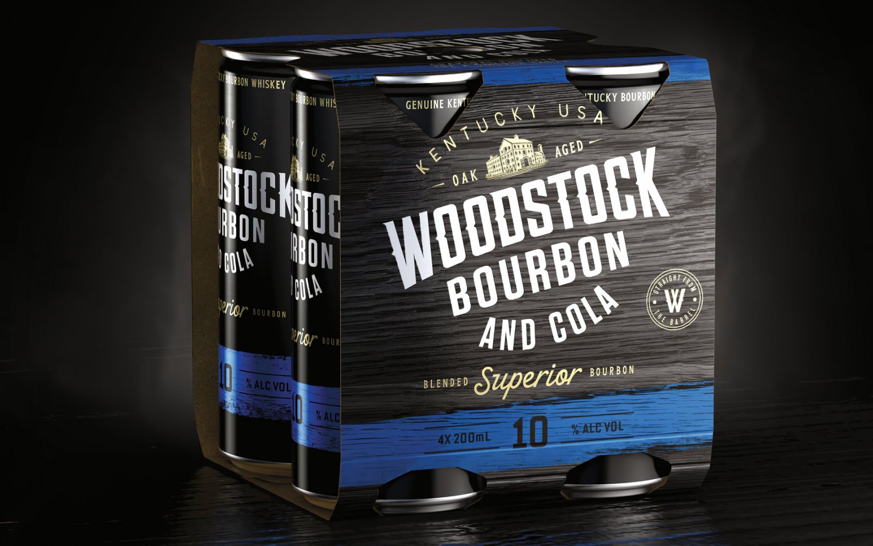
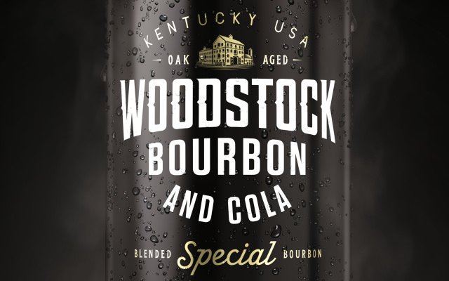
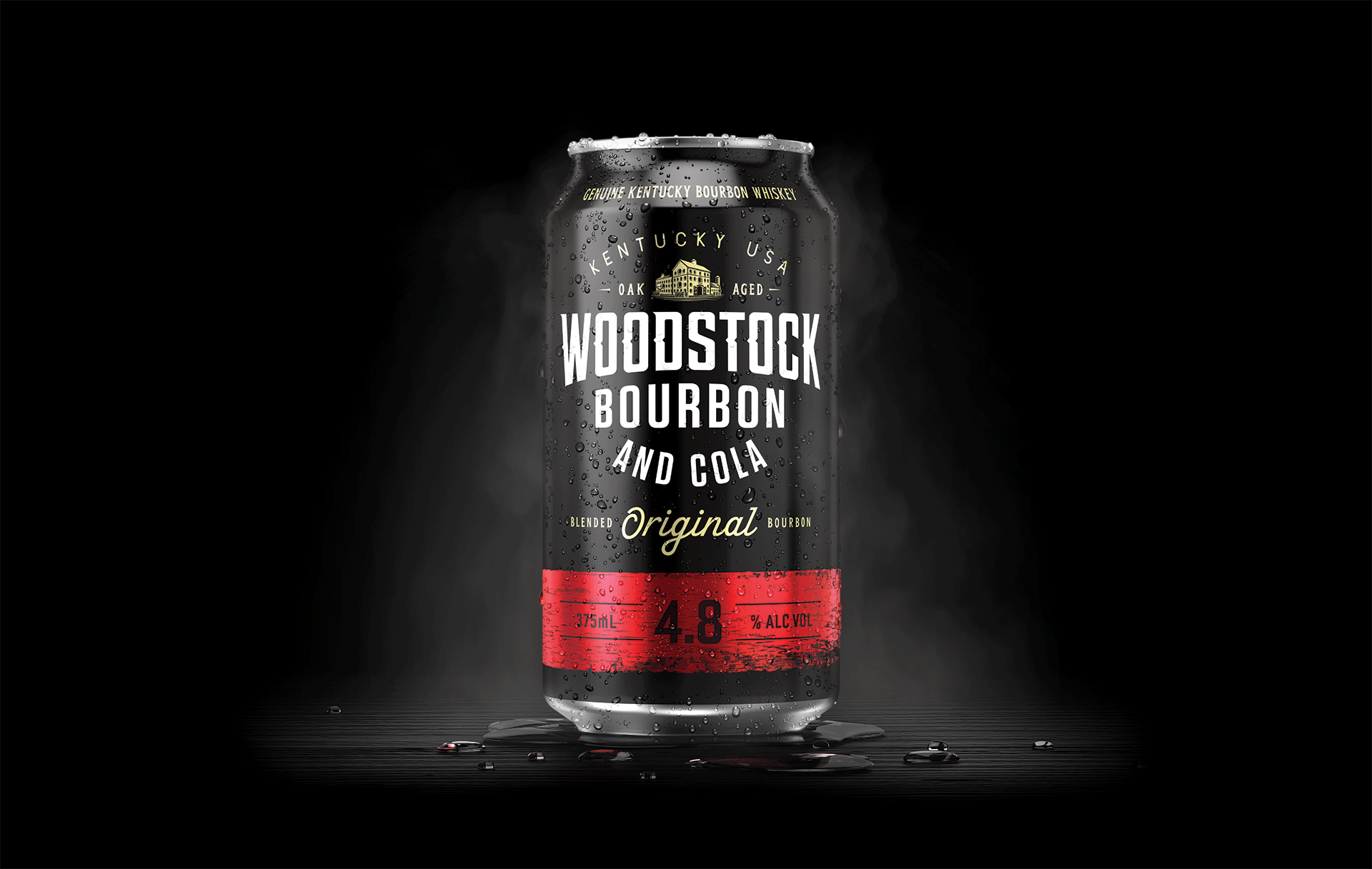
The refreshed Woodstock brand has broadened penetration by recruiting a younger audience and provided lapsed and current drinkers the social permission to enjoy Woodstock again by destigmatising the purchase decision and reconnecting with the brand’s heritage relevant to a more sophisticated consumer aligned to today’s cultural social norms. Fluid’s careful redesign of the packaging projected the quality of the product and leveraging taste and process cues, without losing a clear connection to existing equities.
The majority of bourbon RTD drinkers navigate by ABV. Fluid provided Woodstock with brand semiotics that was easier to shop by applying distinctive colour to SKU – to promote faster navigation on the shelf.
By broadening appeal we created a more sophisticated platform for the Woodstock Brand, which has engaged with the desired new audience 18-24-year-olds without alienating older customers 35+ audience – with impressive first-quarter results of 11.8% growth following the brand refresh without any ABL support.

Branding The Best In Beef

Branding Dairy’s Future

Branding A Gateway To Premium Beef