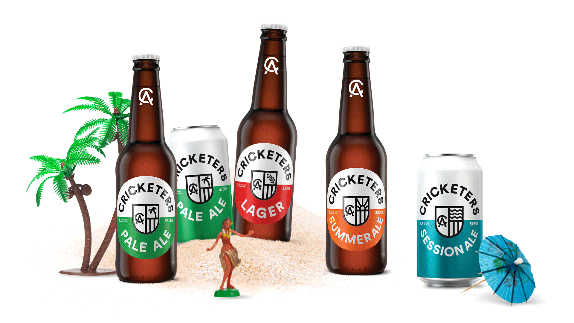
Cricketers Arms is an Australian craft beer owned by Japanese multinational corporation Asahi Beverages. Originally, Cricketers Arms brand was inspired by the local tradition of sharing a post-match beer.
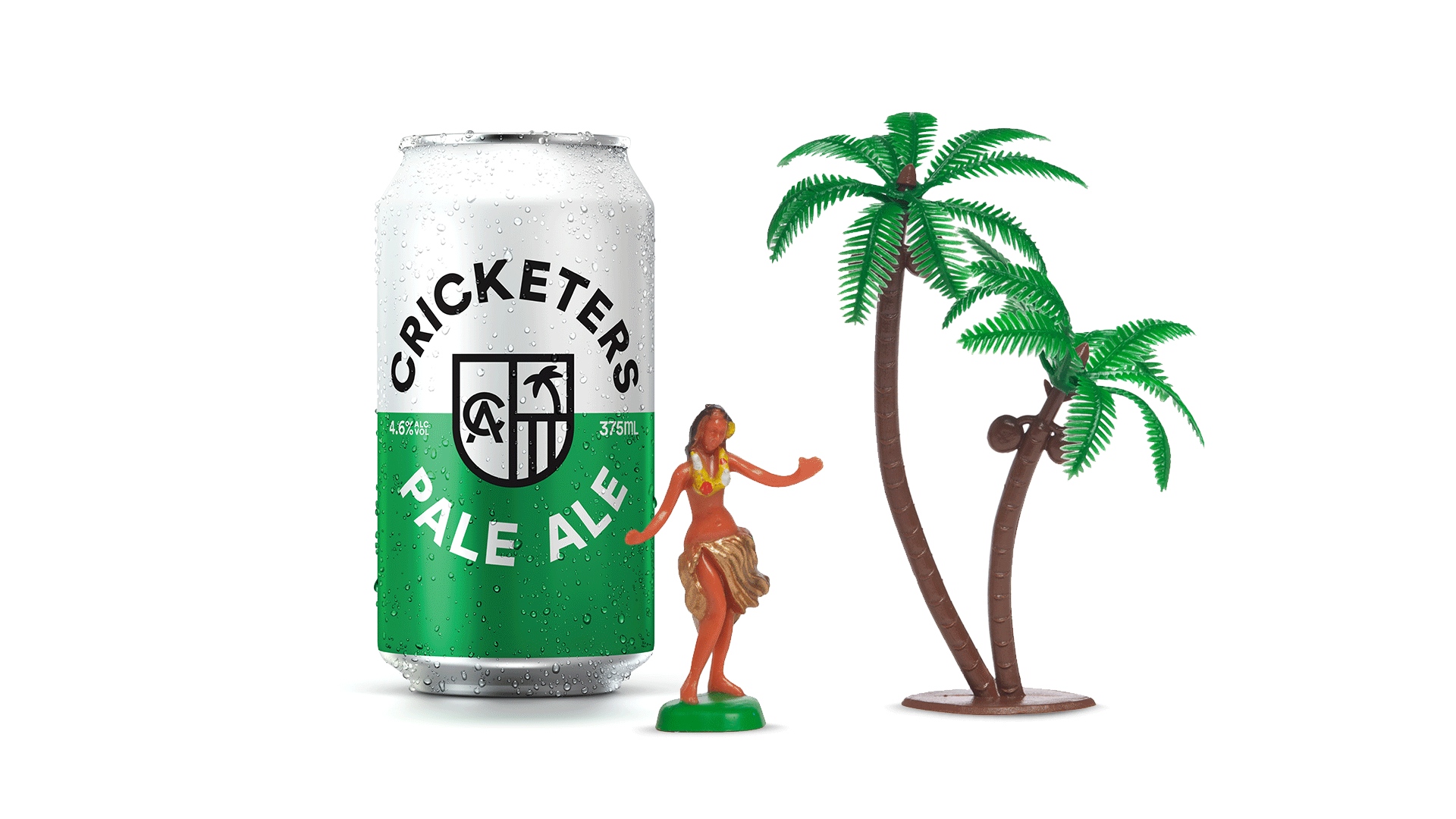
Asahi was seeking to reposition the brand. Asahi's research found that to achieve more mainstream appeal; there was an opportunity to broaden the brand, beyond its traditional cricketing heritage. The challenge for Fluid was to create a design that no longer 'looked like your daggy uncle's cricketing whites' and would instead be picked up by younger male and female beer drinkers.
Solution
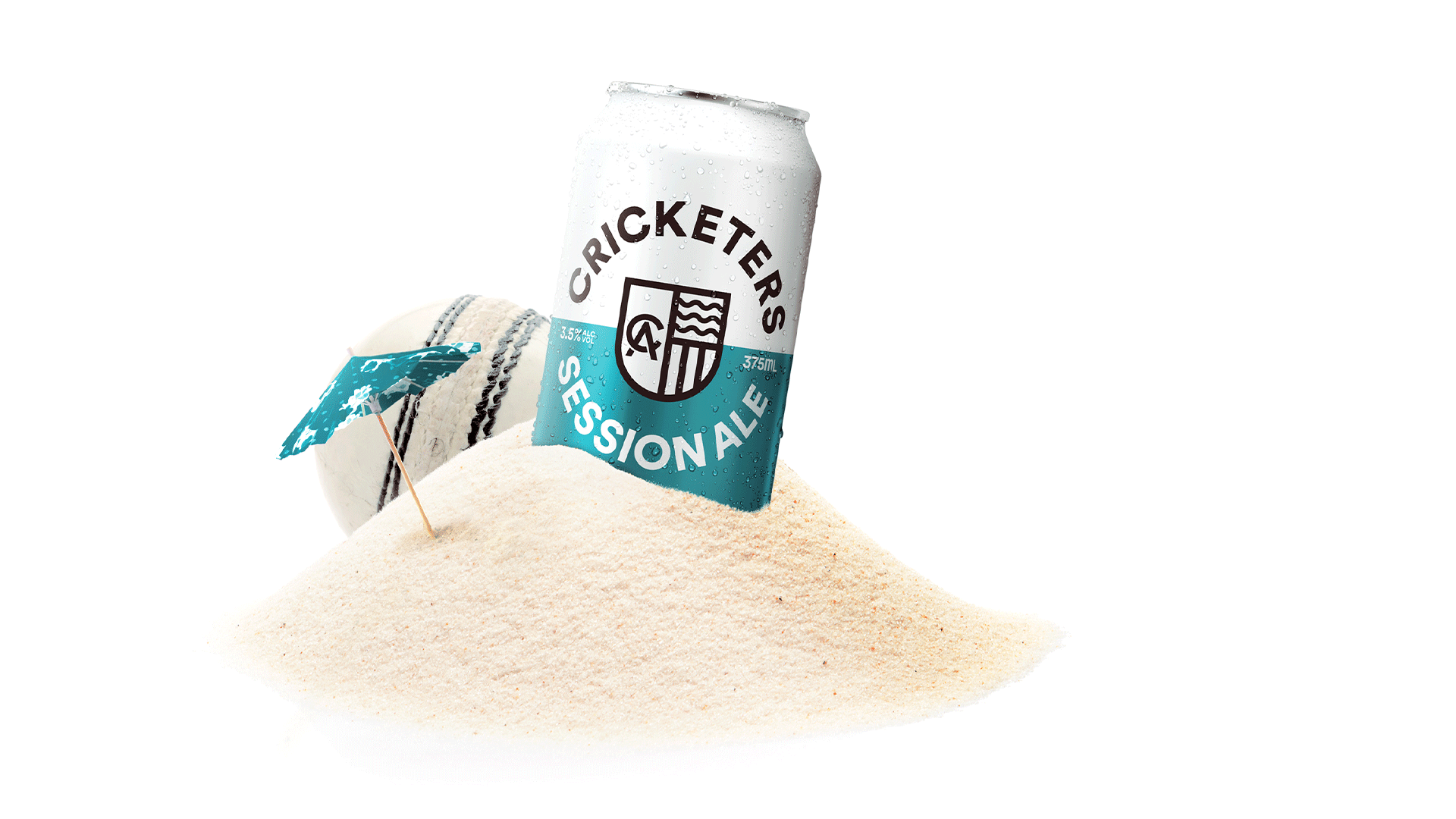
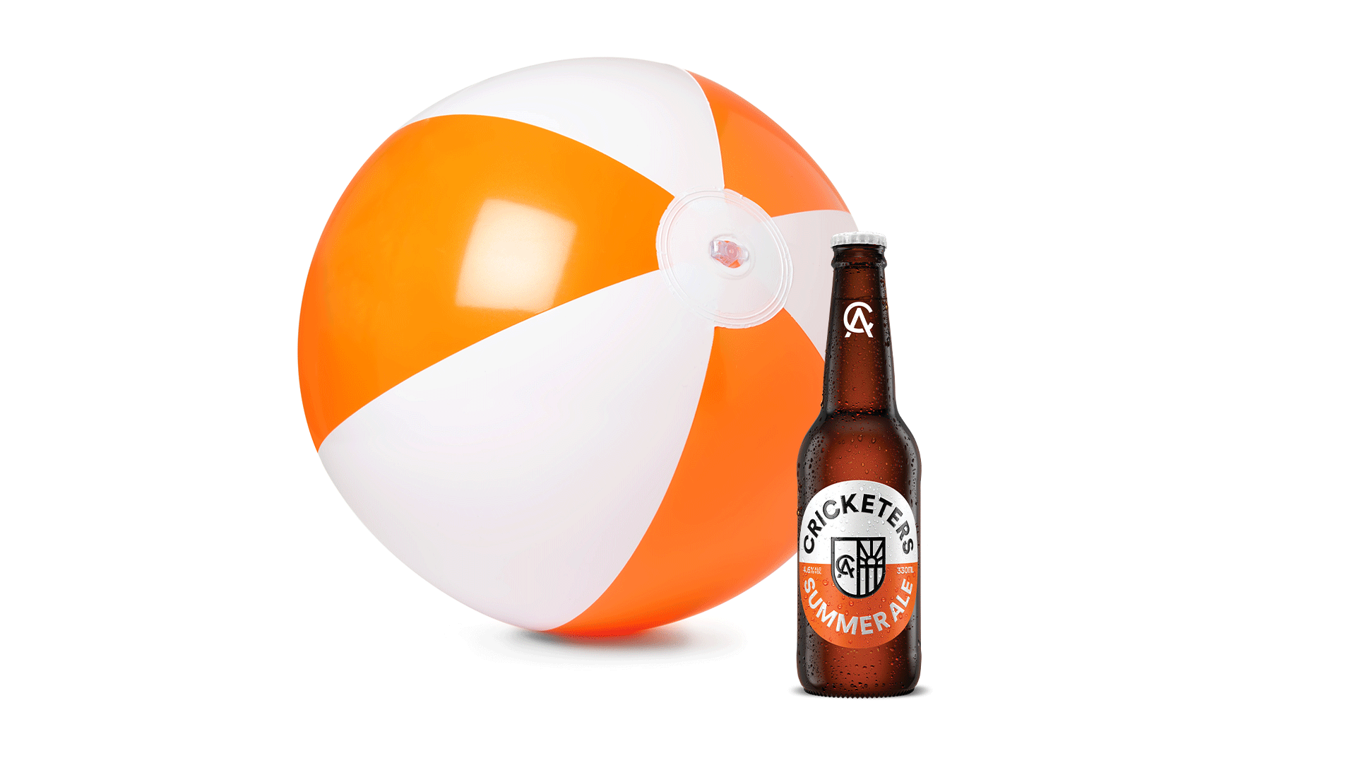
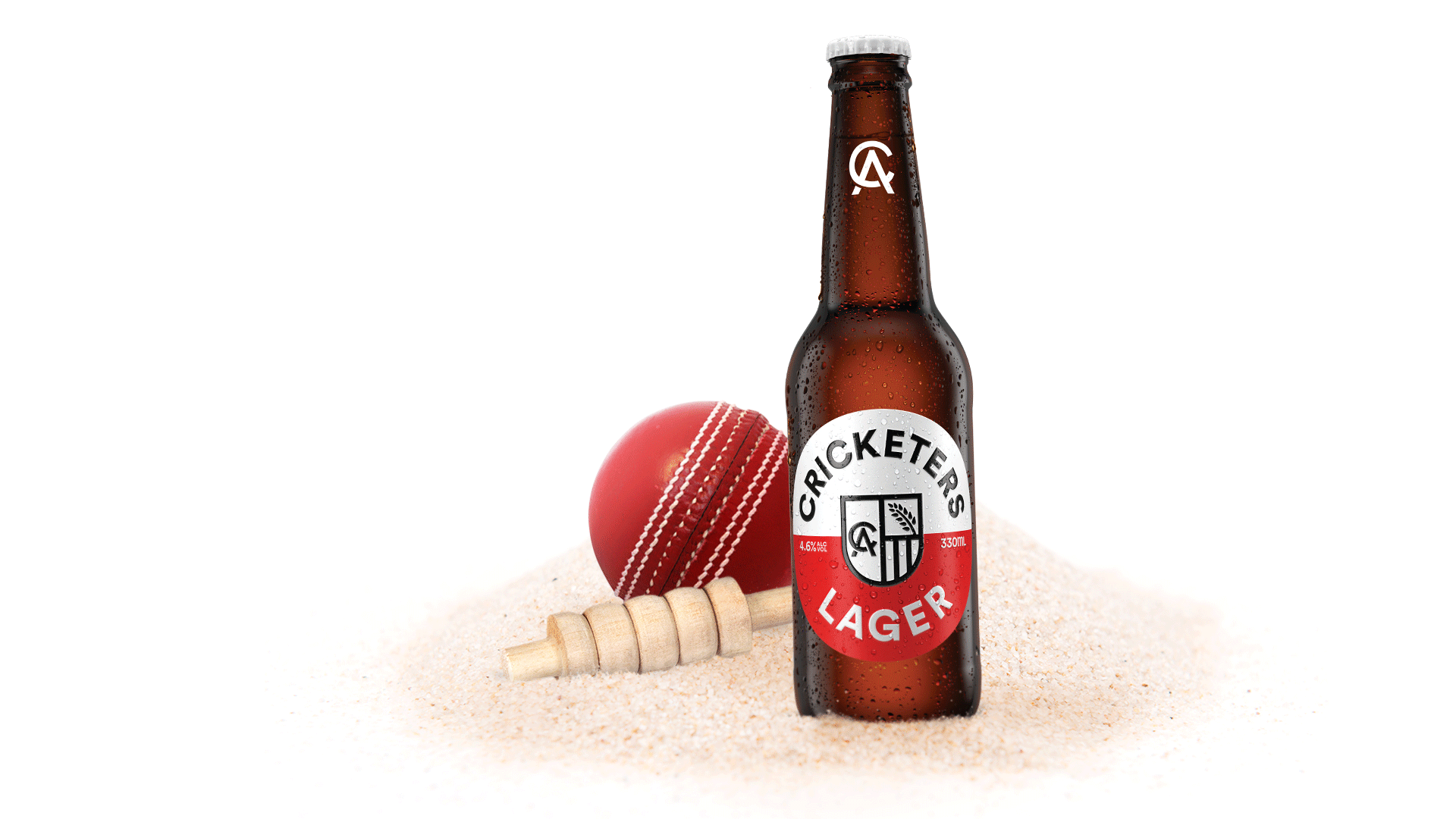
Partnering with advertising agency The Monkeys, Fluid adopted a new brand strategy. The driving insight behind the strategy was; Whilst the game of cricket may have narrow appeal, the game's tours and exotic destinations, was universally appealing for all consumers.
Outcome
The new designs tested positively with all key audiences, including a 14% increase in purchase intent and 19% broader consumer appeal.